Because of the wide range of facilities that we use to set up our FTD's, there is not a '1 size fits all' solution for our external signage that is available for you to download immediately.
Instead we have have developed a set of visual themes that influence our approach to the appearance of each FTD and help make every location look as consistent as possible.


In order to prepare draft concepts for the outside appearance of your FTD, our design team will need you to supply some photography of the outside of your building as well as approximate dimensions of the area including the proposed signage space available (including any window signage opportunities for consideration). Using this information we will prepare 3D renders to help demonstrate the proposed signage for your FTD
You can download a sample PDF below that demonstrates some of our previous FTD designs as a reference on what to expect, or you can continue scrolling below to see the main imagery used in most FTD's....

Here are some visual elements we usually include in our external FTD Signage...

Our Club Logo
Our most important external design feature is our club logo. This branding element features on all FTD's and is usually positioned in the location with the highest visibility. The exact layout of this logo might vary depending on the space available and may appear as a portrait or Landscape design. The background for this sign will usually be white accompanied by our standard logo colours.


The FTD Entrance
Where a Dojo entrance has double glass doors, the graphics will usually be as follows.
1.In most cases, the actual doors of the entrance will remain relatively transparent with only minimal vinyl text applied to them (This is to ensure people can see on the other side and don't run into people).
2.Where available, the glass panels on either side of our entrance will display the characters of our club Kanji (in black) on a white background.
3. Depending on the available space, we will also often attempt to display the word: 'entrance' above the doors in white text, on a red background, but If space is limited this may instead simply be replaced with a thin red stripe above the entrance (in some cases this stripe may extend from the entrance and extend onto other windows panels as well)
SPECIAL NOTE: Some of the design elements mentioned above may be adjusted to offer a more tailored solution if a location doesn't have an entrance that allows for all the features discussed. (eg: You may not have the available space around the sides of your doors to display our club kanji, or you may only have a single door entrance etc...)

Karate For Everyone!
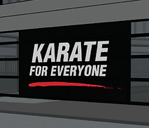
Our "karate for everyone' slogan serves as a decorative feature and also as a core part of our advertising. This design incorporates white text and a red paint stripe positioned over a black background and is usually positioned on the most prominent window of an FTD.

Karate Silhouettes (supplementary)
In rare situations where there is need for additional signage beyond what has been discussed above, we will incorporate our clubs karate 'silhouettes' to offer additional imagery to our FTD.
!
SPECIAL NOTE : WHY NO PHOTOGRAPHY?
We do not use photography in our external graphics for a number of reasons, including but not limited to the following...
1. Due to prolonged exposure to the sun that much of our signage may endure, photography can often becomes faded and 'tacky' after a relatively short period of time.(while solid objects will also fade, it is often less noticeable in geometric designs than it is with photography)
2. Photography can be quite emotive when executed correctly, but due to our wide demographic of students it would be difficult to properly capture what our club is all about in a single image. Focusing on child focused imagery would give a sense that where a 'kids karate' club and may alienate older prospective students, while photography of older students could do the same to people looking for karate for children. By not showing a photo we remain neutral.
3. There is an argument to suggest we could try to resolve the issue mentioned above by using photography similar to the images used on our shopping centre marketing & signage (picture collage of adults & children), but this usually has the result of looking slightly 'sales focused' which is fine for marketing items, but we ultimately want our locations to be something our students can take pride in when they look at and not feel like they're walking into a business/shop.